


Brief
Reposition this eSports PR Agency.
Inspired by eSports teams and the rise of popular streaming platform Twitch, I was approached to reimagine the brand for PR Agency – Swipe Right.
Problem
The client desired a redesign of their brand to seamlessly fit in with other prominent eSports sponsors and teams while also being versatile enough to stand out on its own.
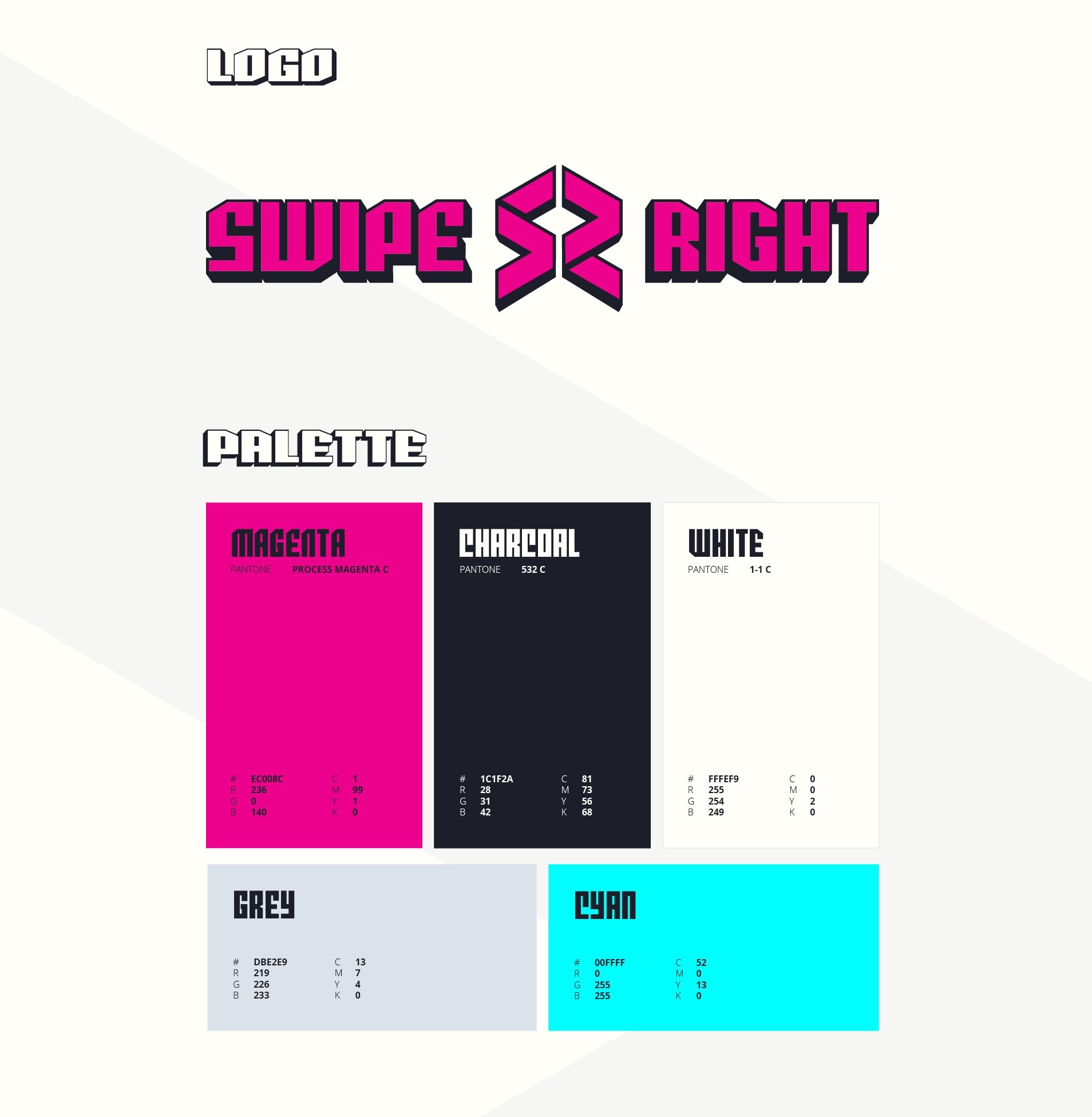
The ultimate design needed to have a modular structure, with an identifiable isometric monogram featuring rightward arrows, as well as a logotype that remained impactful without the use of any iconography.


Solution
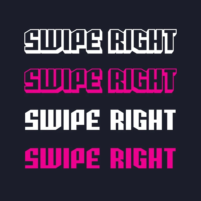
Drawing inspiration from the opening credits of the 'Edgerunners' anime by Studio Trigger, I adjusted a variable font family by Comicraft to find the perfect balance between stroke and space.
By cutting into the letters, we were able to direct attention towards the monogram. To complete the design, we incorporated a bold colour palette and a complementary font.

Workings
We went through many versions before we landed on the final design.
One of my favourite routes used a glitched typography element which complemented the monogram. Unfortunately the sliced treatment didn't make the cut.


More Works


Brief
Reposition this eSports PR Agency.
Inspired by eSports teams and the rise of popular streaming platform Twitch, I was approached to reimagine the brand for PR Agency – Swipe Right.
Problem
The client desired a redesign of their brand to seamlessly fit in with other prominent eSports sponsors and teams while also being versatile enough to stand out on its own.
The ultimate design needed to have a modular structure, with an identifiable isometric monogram featuring rightward arrows, as well as a logotype that remained impactful without the use of any iconography.
Solution
Drawing inspiration from the opening credits of the 'Edgerunners' anime by Studio Trigger, I adjusted a variable font family by Comicraft to find the perfect balance between stroke and space.
By cutting into the letters, we were able to direct attention towards the monogram. To complete the design, we incorporated a bold colour palette and a complementary font.
Workings
We went through many versions before we landed on the final design.
One of my favourite routes used a glitched typography element which complemented the monogram. Unfortunately the sliced treatment didn't make the cut.
More Works